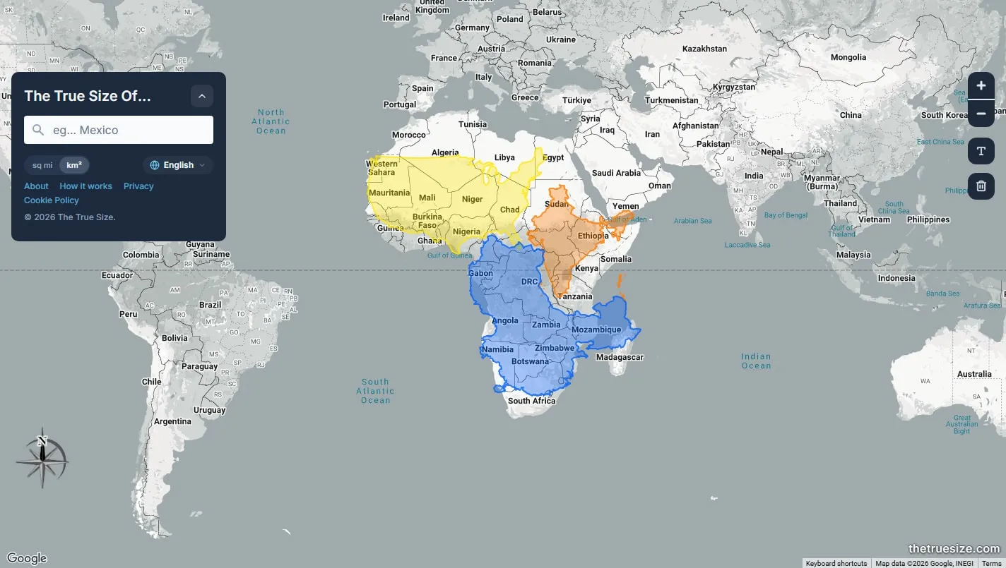
The True Size turns a familiar map misconception into something you can test directly. Search for a country, move its outline towards or away from the equator, and watch it grow or shrink on the projection while its real area stays the same.
How to use it
Search for a country or territory, select the result and drag its coloured outline across the map. Add several outlines when you want to compare places directly rather than relying on remembered map shapes.
What changes
The country itself is not being resized. The map stretches land more severely towards the poles, so moving an outline to a different latitude reveals how much the familiar Mercator view has altered its appearance.
A useful classroom check
Put two countries near the equator before comparing them, or overlap their outlines. The tool is strongest as a quick visual demonstration; use published area figures when you need an exact numerical comparison.
Things to know
- The Mercator map remains the underlying display.
- Outlines are better for visual comparison than exact measurement.
- The consent screen includes a long list of advertising partners.