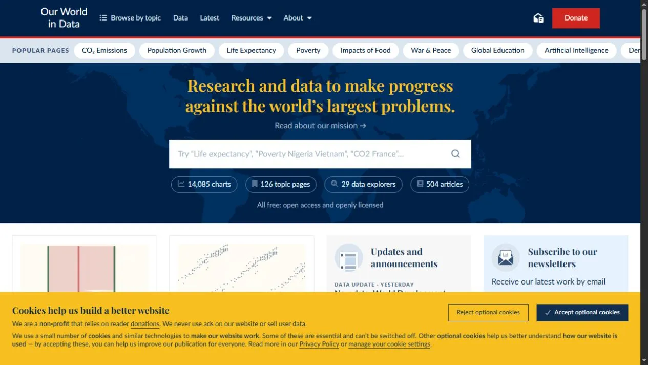
Our World in Data combines explanatory writing with reusable charts and downloadable datasets on health, energy, population, inequality, technology and the environment.
What it provides
Topic pages connect narrative explanations to interactive charts. Most charts allow country comparison, timeline changes, table views and direct data downloads with source notes.
Why it is valuable
The site makes the path from headline claim to underlying data unusually visible. Definitions and caveats sit close to the visualisation instead of being hidden in a separate technical report.
How to use it
Read the chart note before comparing countries, then open the Sources tab and download the data when numbers will be reused. A clean graphic is not a substitute for checking the measure.
Things to know
- International data can lag by several years.
- Country comparisons depend on consistent definitions.
- The breadth of material can make the first visit overwhelming.