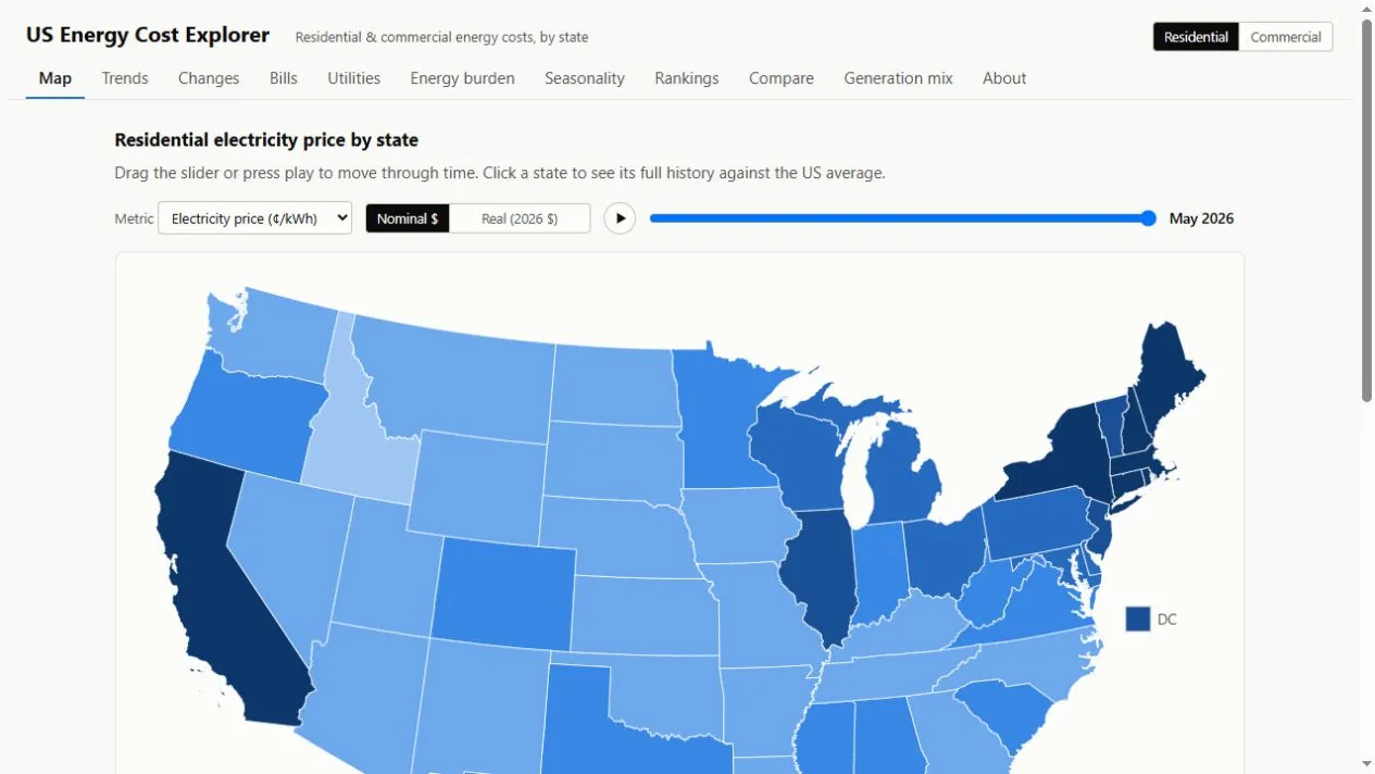
Energy Maps presents US residential and commercial energy costs as maps, historical charts and comparisons. Switch between electricity and natural gas, explore individual states and distinguish nominal prices from inflation-adjusted figures.
Reading the map
Choose residential or commercial customers, select a fuel and move the time slider. Clicking a state opens its history against the national average, making a single expensive month easier to put in context.
Beyond unit prices
Separate views cover bills, utilities, seasonal changes, energy burden and generation mix. The site names EIA, Census and BLS datasets and displays the period covered by its latest snapshot.
Useful comparisons
Compare like with like: customer class, fuel, month and inflation setting all affect the result. State averages describe a market, not a quote for your home.
Things to know
- US coverage only.
- Published data lags current tariffs.
- Individual bills depend on usage, supplier and local charges.